Hitting the Road in Style: Crafting the Hand-Lettered Identity for Biker Wiken
In the world of motorcycle culture, identity is everything. It speaks to community, freedom, and a love for the open road. We recently partnered with Biker Wiken (likely a contraction of “Biker Weekend” or “Biker Weken” in Indonesian, meaning “Biker Weeks/Period”) to create a robust and authentic brand identity that captures the spirit of their community.
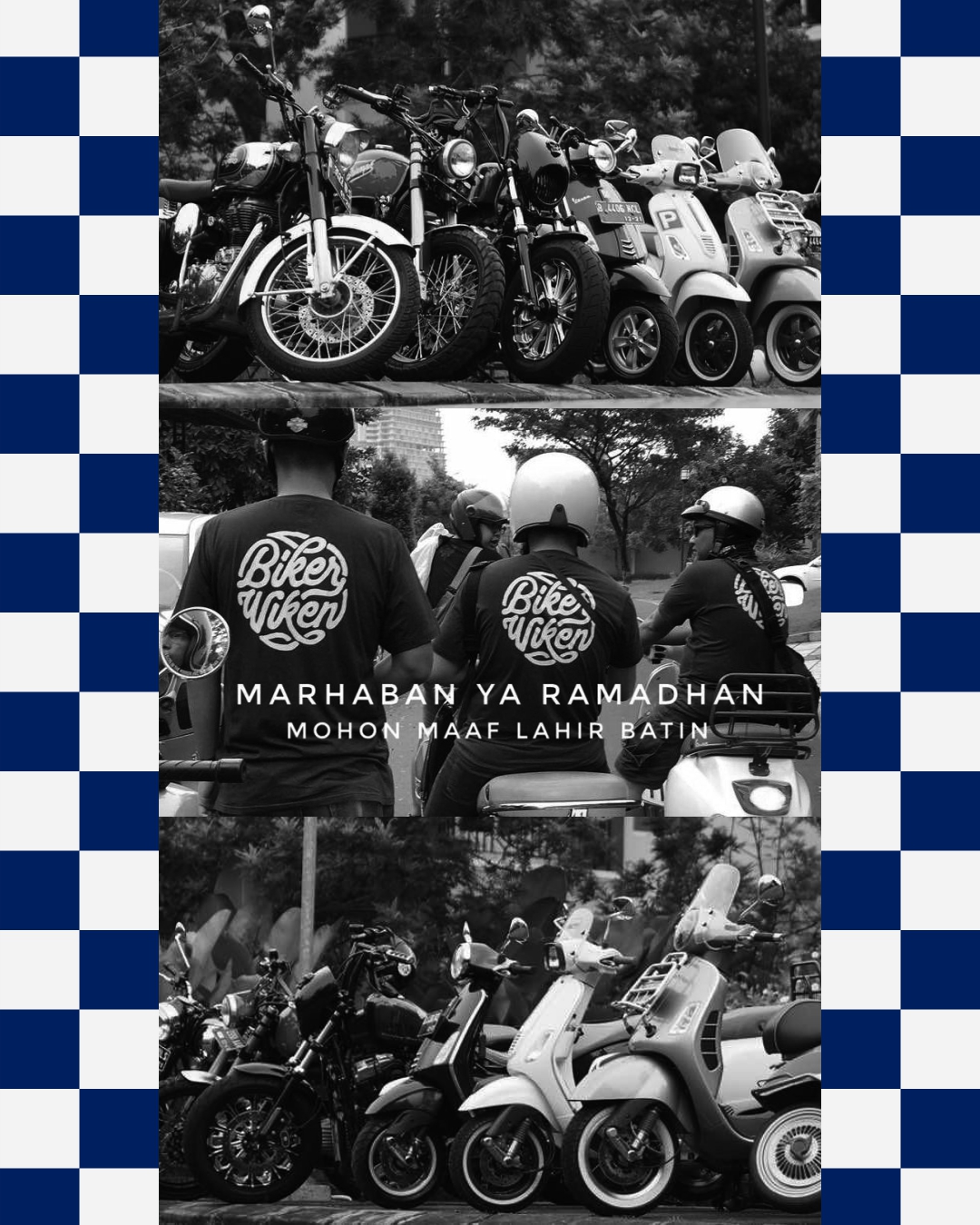
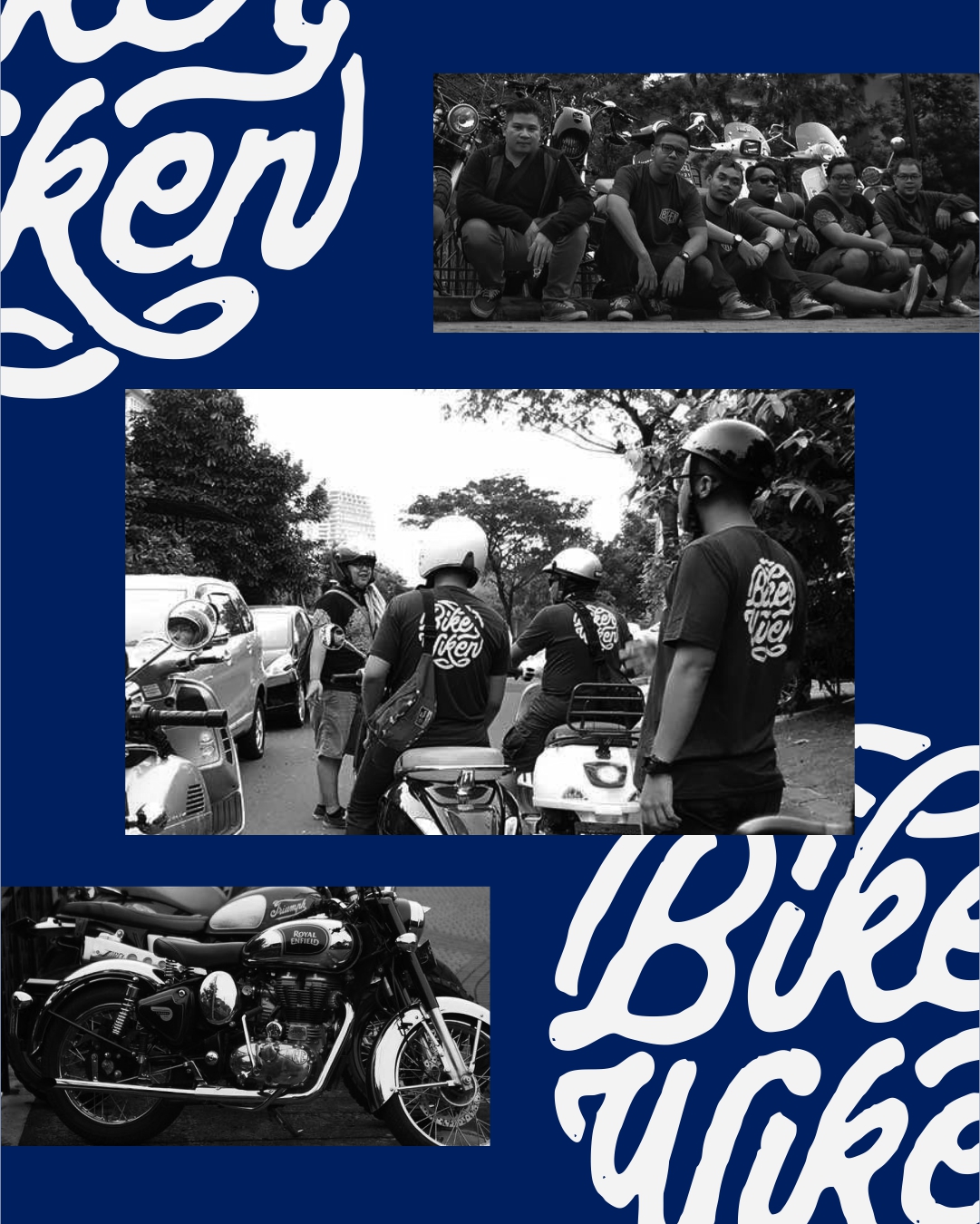
The core of this project was developing a logo that felt custom, energetic, and perfectly suited for apparel and event merchandise.
The Concept: Hand-Lettered Brotherhood
Instead of a generic badge or a slick digital font, we opted for a custom, hand-lettered approach. Hand-lettering immediately gives the brand a human touch, a vintage feel, and a unique personality that stands out from mass-produced designs.
Design Exploration & Final Selection:
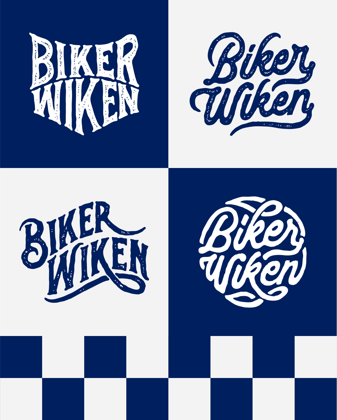
Our initial explorations involved several styles, as shown in the logo grid:
Bold Slab: A heavy, rugged block style suitable for a classic biker patch.
Smooth Script: An elegant, flowing script with strong connections, giving it speed and movement.
Modern Script-Serif Blend: A dynamic combination of flow and edge.
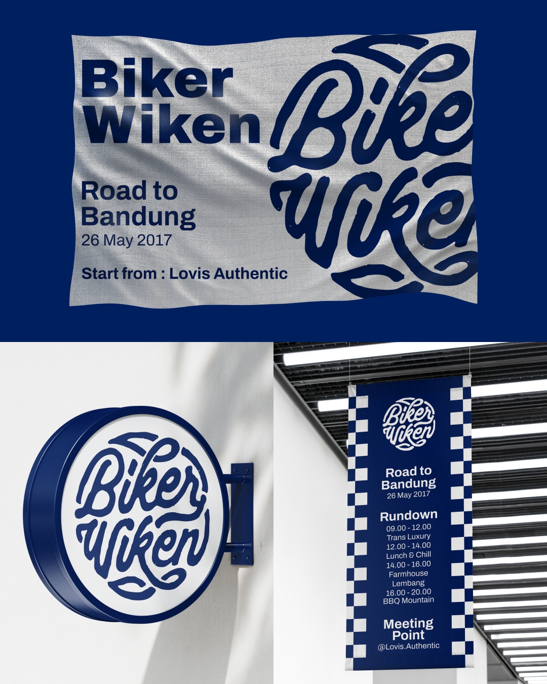
The Final Monogram (Circular): The chosen design is a powerful, tightly-knit circular arrangement. This design is highly practical, as it works perfectly on patches, round signage, and as a clear, impactful mark on the back of a t-shirt. The custom strokes are bold, slightly rough, and convey a sense of genuine, raw energy.